
Aer Lingus
Redesigning the booking experience for the Aer Lingus mobile app
Role:
UX Designer, UI Designer, Researcher
Year:
2023
Overview
Aer Lingus is one of Ireland principal Air Carriers carrying up to 11.6 million passengers each year. In a very competitive market, Aer Lingus competes with a number of airlines, particularly in Europe, on price and convenience.
The problem
Initial assumptions and preliminary research suggested that when booking or searching for flights, passengers will alternate between Aer Lingus and Ryanair and will choose the flight that is cheapest and most convenient with little brand loyalty. While the Aer Lingus performs quite well, there are areas for improvement.
The Opportunity
To explore ways in which the booking process for the Mobile app could be improved so that Aer Lingus can gain a more competitive edge over its nearest competitors.
The process
Double Diamond


Discovery
Affinity map
The first step of research was to challenge my assumption that focusing on the booking process was the most pertinent painpoint to address within the mobile app.
Initial desk research of google play and app store reviews were analysed and organised into five categories. While the exercise validated that booking flights had the most pain points to resolve, it was useful to acknowledge some of the other pain points as the process move forward.

Competitor analysis
Next step was to analyse 4 competitors and compare the booking experience with Aer Lingus. I went through both the mobile and desktop booking experience for each as I wanted to see how seamless the experience was between the two devices. The competitors chosen were Ryanair, British Airways, KLM and Etihad as they all fly out of Dublin and are on various stages of the budget to luxury airline scale.
Some takehomes:
KLM had best UX on balance of things with a quick and easy booking process were extras were optional to select versus a mandatory screen the user must click through on Aer Lingus.
Ryanair has some good shortcuts for preloading information and options to select same seats for return legs to speed up process
Rebooking a trip with all preloaded info was established as a great opportunity to could make AL stand out from competitors.


Surveys and interviews
Research was undertaken into the habits and preferences of booking flights. One of the main research goals was to establish if there was a desire and appetite for rebooking flights. One set of data collected came from a survey which contained 15 questions, edited from a larger list to ensure each question had valuable insights. The survey was posted online and had 57 responses over a 2 day period. To further validate findings from surveys and to gain deeper insights I also conducted an interview with 4 people.

Survey findings
People surveyed were not flying frequently.
There was a huge appetite for rebooking a trip with preloaded info and preferences.
People will choose Aer Lingus if it is cheapest versus competitors.
Interview findings
I interviewed 4 people who had previously completed the survey to gain further insights about their booking preferences, there appetite for rebooking flight with all info preloaded and listen to any other pain points or comments they had.
4 out of 4 loved the idea of rebooking flight with all info and preferences preloaded. This provided greater validation to focus the rest of this project on solving the issue of rebooking a trip so that maximum convenience could be achieved and therefore a greater edge on competitors.
Problem Statement
How can we make the mobile app booking experience for Aer Lingus more convenient and personalised so that it provides a greater edge over competitors?
Summary of discovery

Define
Personas
The two principle personas were Anne, a 27 year who flys regularly on the same trip back and forth to the UK and John, 38 and a father of two who likes to go to the same family destination in Spain every summer. To define how rebooking flights would have the most impact it was important to consider the user journeys of both of these contrasting personas.


User Journey Maps
Knowing these two personas, I set out to map their as is journeys to see where their pain points were similar and where they differed.
In general both personas had similar pain points of having to resubmit more information each time they wanted to rebook a flight. They also expressed frustration of not having some preferences presaved as they might not know exactly what seats, baggage options or extras they choose last time.
This validated that creating one flow that would be tested and could serve as a solution for both of these personas was the desired approach.
Anne

John

Summary of define

Design
Task flow diagram
Task flow diagrams are used to show how a user will navigate a product and what steps are needed to complete a task. Two task flows were created with an aim to do A/B testing, helping to establish where in the flow should users edit the preferences that would be preloaded from a previous flight.
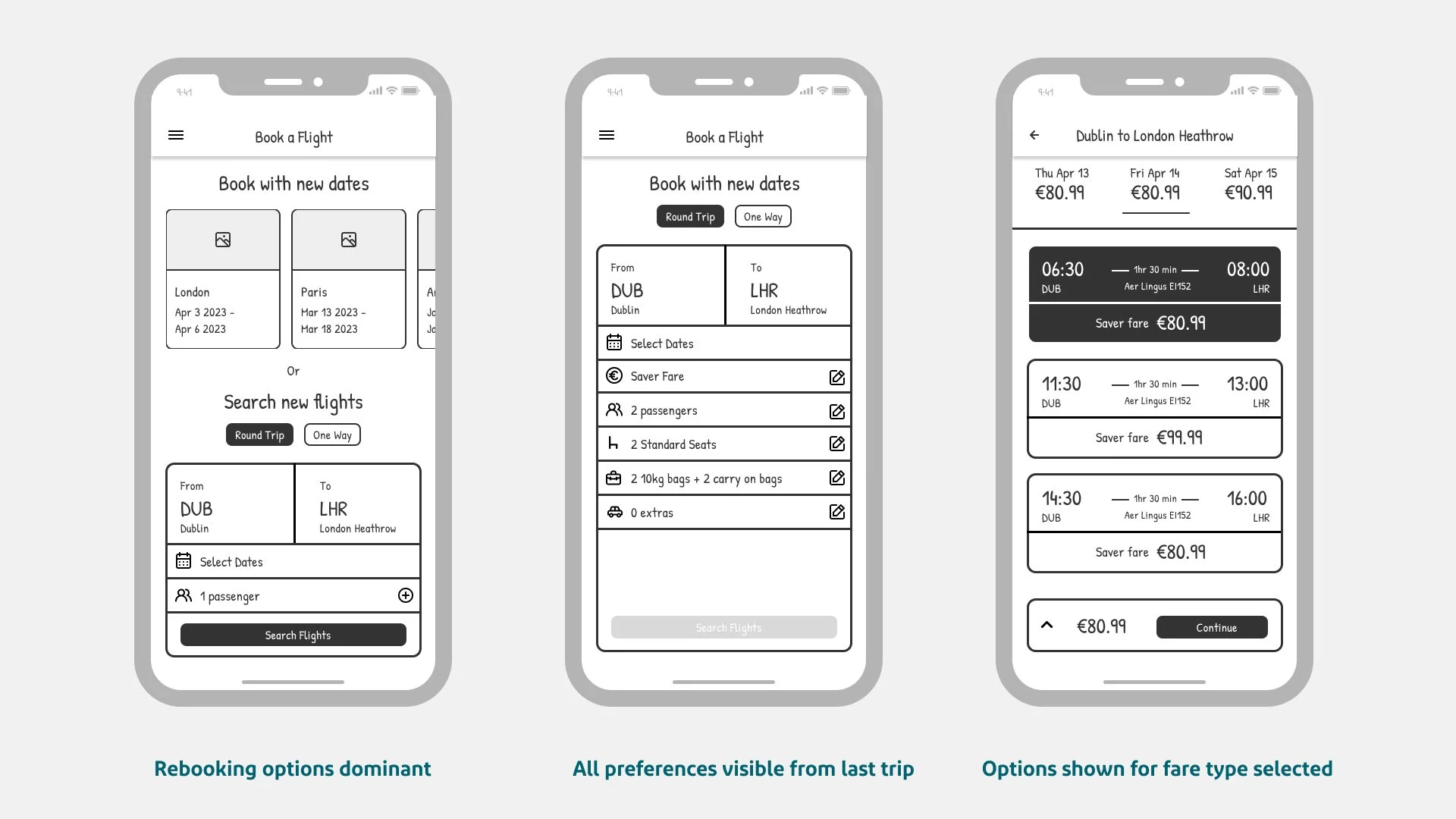
In flow 1 the user would select to rebook a previous trip, select their new dates and then be presented with all the preferences from the last trip in one screen view. The user can make any edits neccesary and then when they confirm they select the flight times and prices and then straight to review and purchase.
In flow 2 the user would go through a more traditional sequence where they select new dates, pick their times and then are asked if they want to use preferences from last time or make edits. The user would go through all screens of booking process confirming or edit details and then would review and purchase.


Paper Prototyping
Although through research, there are potential design opportunities emerging I wanted to get down on paper how the some of the new features I was introducing could be displayed and if they make sense.

Lofi prototype
Next I designed a lofi prototype which further examined how the user flow of rebooking a flight based on task flow diagram 1 would work. This was tested with one user for proof of concept. Overall it was easily to navigate with some minor suggestions for improvement as I developed further into a hifi prototype.
Summary of design

High Fidelity Prototype
I further developed the prototype into two High Fidelity Prototype for user testing. Incorporating Aer Lingus’ branding and colour, the user interface gives users involved with testing a sense of familiarity, reducing the mental load needed to navigate the new process of rebooking.

User testing
I engaged user testing with 5 people and asked them to imagine they were rebooking a flight to london where all preferences remained the same as last time except for wanting to add one more passenger. I asked each tester to test the two flows and then asked for their preference on which flow they found easiest to navigate and provided a better overall experience.

By using 5 testers I was able to gain clarification on what flows and interactions worked best. On the homepage there was 3 ways a user could begin the rebooking process. The first 3 testers all choose a different route but by the end of testing it was a lot clearer with 3/5 choosing one particular route. Heat map information confirmed this.
For both flows I asked the same tasks:
1. Open the app and begin the rebooking process
2. Add another passenger to your trip
3. Review the checklist
4. Complete the booking and pay for flights

Iteration based on feedback
1 Split up passenger add section to make it clearer and easier to add passengers. This also allowed for more real estate on second screen to pre-save passport information.
2. Combined the review and checklist screens into one where users confirm each part of trip easily and quickly. This provides a quick but robust checking system.


Reflection and Summary
Embarking on this project as part of the UX tree mentorship provided a fantastic opportunity to work on a real project with excellent support and mentorship from the best in class in Ireland. Although Aer Lingus had a good mobile app experience, there was a satisfying challenge in diving deep into and exploring enough research to find pain points to solve.
Everything can be improved and through research and design, the concept of rebooking a trip with preloaded info has a lot of potential to improve the booking experience and create a competitive edge. With more testing and refining, the mobile app experience and rebooking trips can only become easier, quicker and a more enjoyable convenient experience for travellers flying with Aer Lingus.
