TravelMaster
App design for drivers of an event travel specialist, carrying people to music and sports events all across Ireland.
Role:
UX Designer, UI Designer, Researcher
Year:
2020/2021
Overview
Travelmaster is an event travel specialist which aims to provide a high end service bringing passengers directly to the door of festivals, concerts and sporting events.
The problem
Following some initial research with the client, we discovered through customer feedback that some of the biggest issues in relation to the performance and effectiveness of the bus driver included; the bus arriving late to the event, driver getting lost or going the wrong way, passengers not being contacted after the event, especially if bus had being moved from parking location, buses leaving without passengers and passengers getting onto wrong buses.
The Opportunity
In light of the COVID-19 pandemic, Travelmaster approached me to explore ways in which the digital offering could be improved for the bus drivers driving their routes in preparation for the return of events in 2021.
The process
Lean UX: Think, Make, Check


Think
Problem Statement
Travelmaster was created as a high standard service providing passengers with door to door concert and sports event travel experiences. We observed that expectations aren’t being met as buses are late or taking the wrong route, increasing disatisfaction for passengers. This is leading to bad reviews, having an negative effect on our business. How may we improve the technology offering for bus drivers so they can perform more effectively?
Business assumptions
1. TravelMaster believe the drivers have a need to have all trip information in front of them.
2. These needs can be solved with technology.
3. The number 1 value a driver wants to get out the service is peace of mind and trust in the system.
4. Additional benefits include increased confidence in using the system which will improve the customer’s experience.
5. TravelMaster acquire the majority of drivers through operators that they hire.
6. The biggest product risk is that technology could fail. A back up is needed to ensure a consistent protocol amongst all drivers.
7. This risk could be solved through a paper back up list of passengers provided for the driver.
8. If an app is too difficult for the driver to use, the business could fail.
User assumptions
1. The driver is an employee of a contracted company (40-65 years old).
2. The app would be used as part of the workday.
3. The app would solve the problem of providing correction information to the driver all of the time.
4. The app would be used on the day of event.
5. The app must be very simple and easy to use. It must display a larger font as needs to be glanced at easily whilst driving. The app needs to be updated regularly from administration and needs to be accurate
Feature prioritisation

The route for the map was considered the biggest priority at 19 points follow by the ticket scanner (18), 2 features (contacting administration, driver log in) scoring 17 points and passengers details and pick up points scoring 15 points. As these features scored almost as high as each other, it was important to consider all of these of key focus points for further research and development.

Hypothesis
We believe that passenger and business growth will be achieved if bus drivers attain confidence with an easy to use app with all information within reach.
We will know we are right when we see more positive reviews and passenger numbers increase.
Sub hypotheses
We believe that an app which shows driver a full route itinerary will give driver confidence and avoid confusion or stress. We will know we are right when driver knows all information about next stop on route including time to route and numbers of passengers.
We can test this by creating prototypes and layouts, test user knowledge of route stages and assess user confidence and satisfaction rates through a series of follow up surveys.
We believe that an app with a clear and easy to follow route map will allow bus drivers to complete their trip more effectively. We will know we are right when the bus driver reaches the correct destination.
We can test this by creating prototypes, testing a route scenario with our target audience and observing task completion rates.
We believe that an app which updates the route map to reflect increased traffic, accidents and detours will relief driver of stress relating to unexpected changes. We will know we are right if driver has continued on route without need to reach out to administration.
We can test this by a prototype which simulates a disruption to the route with follow up survey to assess success.
Surveys and interviews
Research was undertaken to understand the end user and help address genuine needs. As the user audience was bus drivers, a very specific section of the public, and because access to this audience was somewhat limited, it was felt that a survey which could be easily distributed online was the most appropriate way to gather more information. 12 questions were devised and the surveys was shared amongst a few Irish based bus driver facebook groups.
Survey findings
The survey provided some interesting results to bear in mind. Whilst some answers justified user assumptions about age, others were more surprising.
There was an overwhelming opinion for those we surveyed that unexpected changes along a journey was the most stressful aspect of their day. Drivers also felt anti-social behaviour was the most difficult aspect of dealing with passengers, acknowledging that the safety of the driver is of extreme importance and should be highly considered when designing a digital product that enhances the driver’s experience.

Persona 1

Persona 2

Competitive Analysis
Rally have a more comprehensive digital offering than TravelMaster including an app for both passengers and drivers. For drivers, the user can easily see daily schedules, route itineraries, maps and detailed passenger lists. Most importantly, information is constantly updating.


Zeelo also provides an app for both passengers and drivers and for drivers the app contains important information including schedule, time til next trip start, each stop and detailed passenger list. The app also allows the bus driver to share its location adding an extra level of safety, confidence and security.
TravelMaster’s most direct competitors are Concert Bus, Buses to Concert and Irish Concert Travel. All three of these companies operate similar to TravelMaster in providing transport directly to festivals and music events. Like TravelMaster, these companies offer an online ticket purchase service with some companies offering day of, cash transactions. There is no app integration for either passenger or drivers and the boarding procedure relies heavily on printed passenger lists with little to no ablility to update passengers, administration or drivers as changes arise.
Design Opportunites
By looking at TravelMasters direct competitors and by benchmarking against best in class through the likes of Rally and Zeelo, several design opportunities presented themselves. As none of the nearest competitors have addressed the issues that are also affecting TravelMaster, this gives TravelMaster the perfect opportunity to gain a commercial advantage through the implementation of smart technology to create seamless and intuitive user experiences for their drivers.
Make
Experience Map

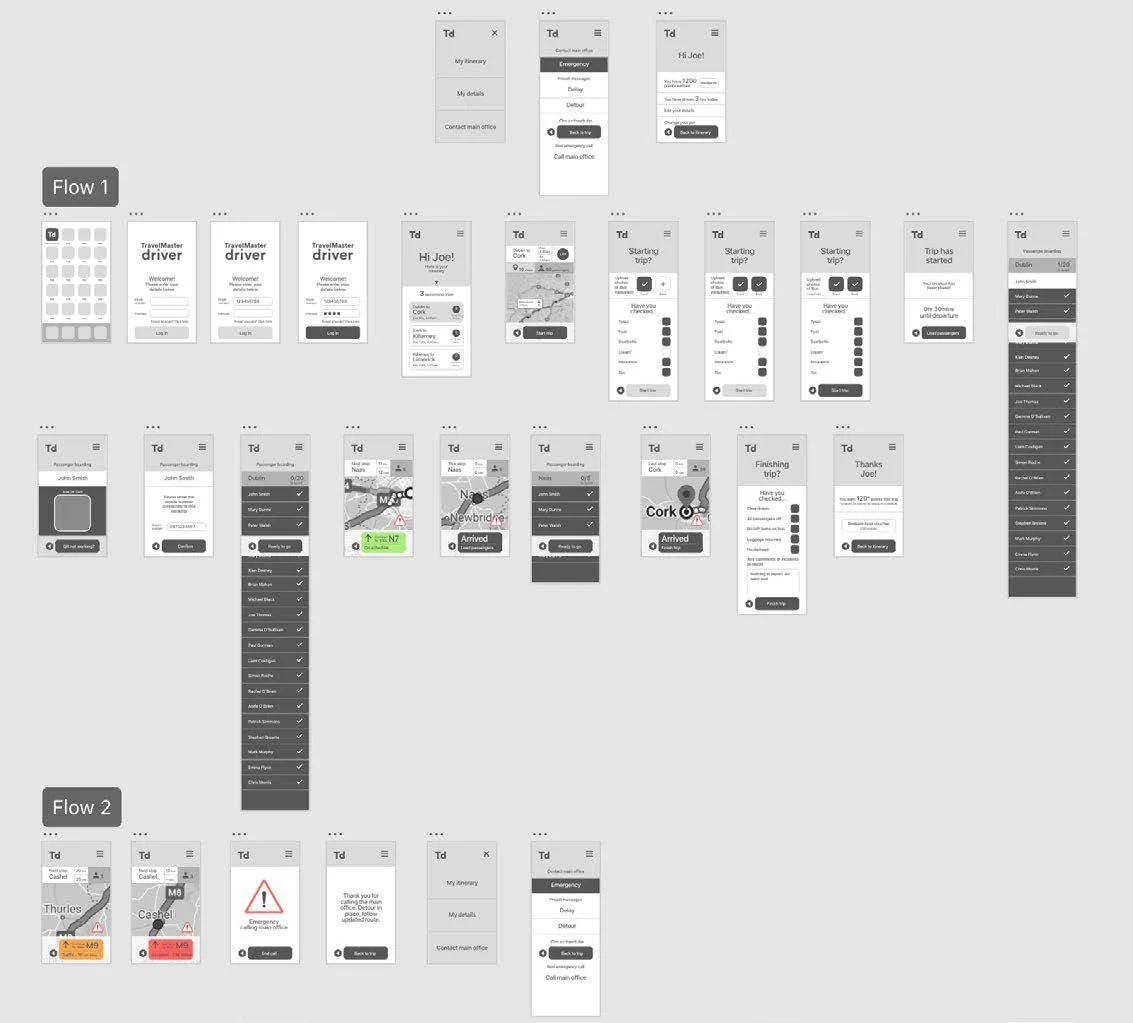
Task flow diagram

Paper Prototyping
Paper prototypes are a quick and easy way to explore whether the UX strategy and the solutions you are proposing are validated and have the desired outcome with the user.
During an initial testing with one target user 2 tasks were asked of and follow up data was gathered through survey questions. Collectively this information was used to inform further refinement of the prototyping and design.
The user were asked to:
1. Open the app in test 1 and proceed through the steps of getting the bus to the destination. The QR Scanner hasn’t be able to scan the passenger’s ticket.
2. Respond to an accident along the journey.

Key findings from paper prototype
The marvel paper prototype was tested by one member of the bus industry. A survey was sent out along with a set of commands for two small tests. The results from this participant indicated that the tester was able to complete both task as expected, with no issues.
While more testing and user research is needed, the prototyping validated the direction of the app and justified moving the prototype to the next stage of a high fidelity Minimum Viable Product (MVP) to investigate further.

Check
Minimum Viable Product (MVP)
The MVP was used to conduct further test with the target user base to gain more and more insights and feedback. An important feature to this round of testing included a traffic light system. A traffic light system on the map is a key indicator of performance for a driver while on route and is a call to action in the case of emergency.
The test were purposefully designed to understand how intuitive the colour system was while getting the user to perform the same two tasks the previous testers performed with the paper prototype.
Key findings from MVP prototype
User testing carried out by a TravelMaster representative. The representative tested the MVP created for this user experience. This testing was conducted via a live video conference and in the moment feedback was provided as the representative moved through the prototypes. The representative was asked to complete similar tasked asked during the paper testing experience and provided some minor suggestions on how experience could be improved.

Make again
User Interface Design
User Interface Design or UI is a design of the visual elements of an app or digital experience. For TravelMaster it was crucial to create a striking User Interface which would enhance the User Experience and fully communicate TravelMaster’s brand essence and achieve their business and user goals.
When designing the user interface psychological factors were taken into consideration but first a few simple adjustments were completed based on the previous round of feedback such as reducing the size of the header area.

Psychological factors
In making decisions throughout an app, the user makes mental shortcuts to help them along the way. These are referred to as heuristics. UI designers can capitalise on heuristics to make design decisions which based on a sense of user understanding, cut out the decision making involved and provide a quicker and more enjoyable experience.
In designing the TravelMaster driver app a number of psychological factors were employed including the fluency heuristic, naive diversification and fitts’ law.

Fluency heuristic
The fluency heuristic is based on the idea that people tend to make decisions based on which option is easiest to process. In design terms, a user experience is successful when a user is able to make quick decisions based on how easily it is to process the information.
When designing the TravelMaster, attention was paid to using clear, easy to understand language and in particular relation to the map feature, having the current screen trip appear as the first screen the user encounters after log in helped the user make easier and quicker decisions.

Naïve Diversification
People tend to make choices that are more diverse when multiple options are presented to them at once, rather than sequentially. This is what is known as the naive diversification heuristic.
Because one of the key needs for the driver app is to limit the amount of choices for the driver while completing their tasks, the naive diversification heuristic was consider throughout. Drivers need to use the app quickly and at the often times while travelling where information needs to be processed without diverting much attention for the driver from the road. Limiting the choices on the menu to 3, having a select number of options for each process helps the driver make quick decisions each trip without delay.

Fitts’ law
Fitts’ law is described simply as “...the time to acquire a target is a function of the distance to and size of the target” (Interaction Design Foundation, 2019). When the optimum target is positioned further away or if the target is smaller, this can make the time the user takes to make a decisions much longer, thus complicating, confusing and frustrating the user.
All essential functions were positioned closer to the bottom of the screen nearest the user thumbs. A large target area allowed the user to make the most important decisions throughout the app quickly and easily.
Check again
Usability testing
In testing the TravelMaster driver app a group of 3 testers was used. One tester was male (63) who represented the main target group based on initial surveys. The second tester was male (32) who represented the second most common target group. The third tester was female (30) who did not represent a target group but acted as a control group and also a potential group for growth.
Due to ongoing COVID-19 restrictions, all tests were conducted remotely and were screen recorded, with the permission of the testers. A link to the test was sent, along with a short follow up survey to gather any additional information or feedback which wasn’t captured during the test.
I asked each tester to perform five tasks, one by one, and to pause after each test and await the next test. These were:
1. Open the app icon, register and log in. Pause when you have this completed and we will move onto the next task.
2. Examine the map and tell me how many people are to be picked up in thurles?
3. Begin the trip and load the last remaining passenger where the qr code isn’t working.
4. Respond to the emergency on the journey and continue the trip.
5. Finish the journey
In general the tests produced a favourable success rate.

Overall, the usability tests justified that the app experience was majority positive. There are a few issues to correct in the next iteration.
For example refinements were suggested to improve the grouping of objects to make it clearer that it is a necessary item to check off. Further thought should also be given to how the emergency contact symbol can be more obvious as a call to action. While 2 out of 3 testers were able to contact emergency by pressing this symbol one tester failed to contact emergency as it wasn’t clear to them.
Taking on board all the comments and refining and reiterating the prototype, an optimum user experience will be achieved.


Final high fidelity prototype based on feedback
Based on feedback from the usability testing a final high fidelity prototype was created. The high fidelity prototype represents a well considered design solution which meets the target user’s needs and fulfills TravelMaster’s business objectives.


Reflection and Summary
By going through the UX process and iterating the app’s experience a final outcome which meets TravelMaster’s business and user needs was achieved. A great deal was learned throughout the process including the importance of user engagement and user feedback. This helped find potential pain points not previously considered and to support and test hypotheses which proved to be right.
It is believed that because of the result of this process, TravelMaster have an app experience which puts them at a clear competitive edge to their nearest competitors, thus providing greater potential for expanding their driver fleet with a network of driver who can provide an excellent service for passengers. With this technology, drivers working with TravelMaster’s have the capability to exceed.